

They Look Great. They Usually Don’t Work.
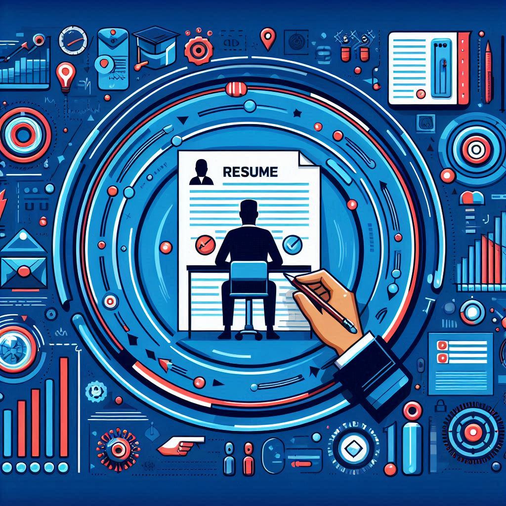
Infographic resumes are visually stunning. Colorful charts showing your skills. Timelines of your career history. Icons replacing bullet points. Data visualizations turning your work experience into something that looks like it belongs in a design portfolio.
The problem is that looking impressive and getting you hired are two different things. In most hiring scenarios, infographic resumes do more harm than good. They fail ATS parsing, they frustrate recruiters who need to scan quickly, and they sacrifice content for aesthetics.
But they’re not always wrong. In specific industries, for specific purposes, and in specific formats, visual elements can set you apart. The key is knowing the difference between a situation where an infographic resume helps and one where it tanks your application.
Why Infographic Resumes Usually Fail
ATS Incompatibility
This is the biggest issue and the reason infographic resumes are inappropriate for most job applications.
Applicant Tracking Systems parse text from documents. They extract your name, contact info, work history, education, and skills by reading text patterns. An infographic resume breaks this process in multiple ways.
Text in images is invisible. If your job title is embedded in a graphic timeline, the ATS doesn’t see it. If your skills are represented as icons with labels baked into the image, the ATS can’t read them.
Charts and graphs don’t parse. A bar chart showing “Python: 90%, JavaScript: 85%” is readable by a human but invisible to an ATS. The parser sees nothing, or worse, it sees garbled text.
Non-standard layouts confuse parsers. Infographic resumes rarely use standard section headers or linear top-to-bottom layouts. They use circular designs, multi-column grids, and creative section arrangements. The parser doesn’t know where to look for your experience.
Tables and text boxes break extraction. Many infographic elements are created using text boxes in Word or Illustrator. ATS parsers often skip text box content entirely.
The result: your beautifully designed resume enters the company’s system as a mostly empty record. The recruiter searching for “project management” won’t find you, even though your graphic timeline prominently features three project management roles. The parser never extracted that information.
Recruiters Don’t Have Time for Them
The average recruiter spends six to eight seconds on an initial resume screen. In those seconds, they’re looking for specific information: your current role, your relevant experience, your key skills.
A traditional resume puts this information in predictable locations. The recruiter’s eye knows where to go. An infographic resume forces the recruiter to figure out your layout first, then find the information. That’s an extra cognitive step they don’t want to take when they have 200 more resumes to review.
Some recruiters actively dislike infographic resumes. They’ve been quoted in surveys saying that visual resumes feel like style over substance, that they make it harder to compare candidates and that they’re often used to disguise thin experience.
They Sacrifice Content for Design
An infographic resume typically fits on one page (it has to, since the visual elements take up so much space). But the amount of text that fits on that page is dramatically less than a traditional resume.
A standard one-page resume fits roughly 300-400 words of content. An infographic resume of the same page size fits 100-200 words, because the rest of the space goes to charts, icons, timelines and white space around visual elements.
That means you have half the content to work with. Half the bullet points. Half the metrics. Half the evidence of your qualifications. In a competition where specificity wins, you’ve voluntarily reduced your ammunition.
Skill Level Charts Are Meaningless
The most common infographic element on visual resumes is the skill level chart: a horizontal bar, a pie chart, or a series of dots showing how skilled you are in various areas.
These are useless. What does “Python: 85%” mean? 85% of what? Who determined that number? You did, which means it’s arbitrary. The reader has no way to interpret it. Is 85% better or worse than the other candidates? There’s no standard.
A survey by TopResume found that most hiring managers consider skill level indicators to be filler content that doesn’t provide actionable information. They’d rather see “Built three production applications in Python over four years” than a colored bar labeled “Python: 85%.”
When Infographic Resumes Actually Work
Despite all these problems, there are scenarios where a visual resume is the right choice.
Creative Industry Applications (Sent Directly to Humans)
If you’re applying for a graphic design, UX design, art direction, or creative director role, your resume itself can serve as a work sample. A well-designed infographic resume demonstrates exactly the skill the employer is looking for: visual communication.
The critical caveat: this only works when your resume goes directly to a human, not through an ATS. If you’re emailing your resume to the creative director at an agency, an infographic format works. If you’re submitting through the company’s job portal, it doesn’t.
Portfolio Supplements
The smartest use of an infographic resume is as a supplement to your traditional resume, not a replacement for it. Submit the standard, ATS-compatible resume through the application system. Then include the infographic version as an additional page in your portfolio, on your personal website, or as a leave-behind after an interview.
This way, you get the best of both worlds. The traditional resume passes ATS screening and gives recruiters the structured information they need. The infographic version showcases your design skills and provides a visual summary that’s memorable.
Networking Events and Career Fairs
When you’re handing your resume directly to someone, ATS compatibility doesn’t matter. At a career fair, an infographic resume can catch someone’s eye and start a conversation. It’s a differentiator in a physical setting where everyone else is handing over identical-looking documents.
The same applies to informational interviews and networking meetings. If someone asks for your resume in a casual context, a visual version can make you more memorable.
Internal Applications
If you’re applying for a new role within your current company, the application often bypasses the ATS entirely. Your manager or an HR partner reviews your resume directly. In this context, a well-designed infographic resume can stand out, especially if the role is in a creative or design-adjacent function.
Social Media and Personal Branding
Infographic resumes perform well as social media content. A visually appealing career summary posted on LinkedIn, Twitter, or a personal website gets engagement and can attract recruiter attention. It’s not a job application; it’s a marketing piece.
In this context, the infographic resume doesn’t need to pass ATS parsing. It just needs to look good and be shareable. If a recruiter sees it and is interested, they’ll ask for a traditional resume.
How to Add Visual Elements Without Breaking ATS Compatibility
You don’t have to choose between a completely plain resume and a full infographic. There’s a middle ground: a clean, ATS-compatible resume with subtle visual enhancements.
Use Color Sparingly
A single accent color for section headers or horizontal dividers adds visual interest without breaking parsing. Stick to dark, professional colors: navy, dark gray, dark teal. Avoid bright colors that reduce readability.
Use Icons as Supplements, Not Replacements
A small phone icon next to your phone number or a LinkedIn icon next to your profile URL adds visual polish. But the text must still be there. The icon is decorative; the text is functional. If the icon is the only thing conveying information, the ATS misses it.
Use Horizontal Lines to Create Visual Structure
Thin horizontal lines between sections create visual hierarchy without confusing the parser. They help the human reader scan quickly while adding a design element to an otherwise plain document.
Choose Fonts Carefully
Your font choice is itself a design decision. A resume in Garamond looks different from one in Calibri. Both are clean and ATS-compatible, but they communicate different tones. Garamond feels more traditional and elegant. Calibri feels modern and clean.
Don’t use more than two fonts on a resume. One for headings, one for body text. Both should be standard, widely available fonts.
Use Bold and Capitalization as Design Tools
Strategic use of bold text and capitalization creates visual hierarchy without relying on graphics. Bold your company names and job titles. Use caps for section headers. This is readable by both ATS systems and humans.
Creating an Infographic Resume That Doesn’t Fail
If you decide an infographic resume is appropriate for your situation, here’s how to make one that actually works.
Start With Content, Not Design
Write all your content first in a plain text document. Every bullet point, every metric, every skill. Then design around the content. Too many infographic resumes start with the design and try to fit content into the layout, which results in cutting important information to make space for a decorative element.
Ensure All Text Is Selectable
When you finish your design, open the file and try to select all text. If you can highlight it, an ATS can read it. If any text is embedded in an image or flattened into a graphic, recreate it as actual text.
Keep Standard Section Headers
Even in a creative layout, label your sections “Experience,” “Education,” “Skills,” and “Contact.” Creative headers like “My Journey” or “What I Bring to the Table” won’t parse.
Include Dates in Standard Formats
“January 2020 - Present” or “Jan 2020 - Present.” Don’t replace dates with timeline graphics unless the actual text dates are also present.
Test It
Copy all the text from your finished resume and paste it into a plain text editor. If the content is complete, in the right order and makes sense, your infographic resume will parse reasonably well. If it’s scrambled or missing sections, you need to fix the underlying structure.
The Two-Resume Strategy
The best approach for most job seekers who want visual impact:
Resume A: A clean, single-column, ATS-compatible resume with all your content. Use this for online applications, job boards and any submission that goes through a portal.
Resume B: An infographic or visually enhanced version that showcases your personality and design sense. Use this for networking, portfolio supplements, career fairs and direct emails to hiring managers.
This isn’t twice the work. Resume B is a visual interpretation of Resume A. The content is the same. Only the presentation changes.
What the Data Says
A study by TheLadders tracked recruiter eye movements while reviewing resumes. The study found that resumes with clear visual hierarchy (organized sections, consistent formatting, strategic use of bold) received more attention in the right places than resumes with complex visual designs where the recruiter’s eye jumped around without settling on key information.
Another study by the Kellogg School of Management found that creative resume formats were evaluated more favorably when the applicant was applying for a creative role, but less favorably for non-creative roles. Context matters.
Bottom Line
Infographic resumes are a tool. Like any tool, they work well for specific tasks and poorly for others. Using one for an online application to a corporate finance role is the wrong tool for the job. Using one as a portfolio piece for a graphic design application is exactly right.
For most job applications, you need an ATS-compatible resume that puts content first. For guidance on avoiding common formatting mistakes that trip up ATS systems, read our guide on avoiding ATS pitfalls in resume design.
If you want a resume that looks polished without sacrificing ATS compatibility, 1Template offers professionally designed templates that balance visual appeal with parsing accuracy.
Don’t let aesthetics cost you interviews. Design is important, but content gets you hired.